Below is my personal logo that I updated in 2021 to reflect my personal brand colors:

The original logo was created in 2018 and adapted in 2019 for my first portfolio website. I created the logo using Adobe Illustrator with several aspects of my personal brand in mind.
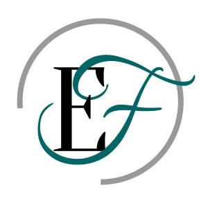
The letters used in this logo are E and F because those two letters form my initials. I chose a standard serif font as well as a script font. The standard serif font represents that I can produce serious and professional work, while the script font represents that I also have a creative and original side.
The circle around my initials is not complete because I hope to demonstrate that my work is not “boxed-in.” I greatly enjoy out-of-the-box (or out-of-the-circle!) thinking, and I am open to opportunities for growth and learning from others.
As for the color scheme, I wanted to choose colors that were serious and yet meaningful to me. Teal blue is one of my favorite colors.
While this logo may not be the forever brand representation that I use for myself, it will always hold a place in my heart as the first official personal logo that I ever designed.
